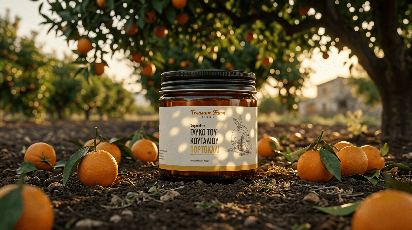
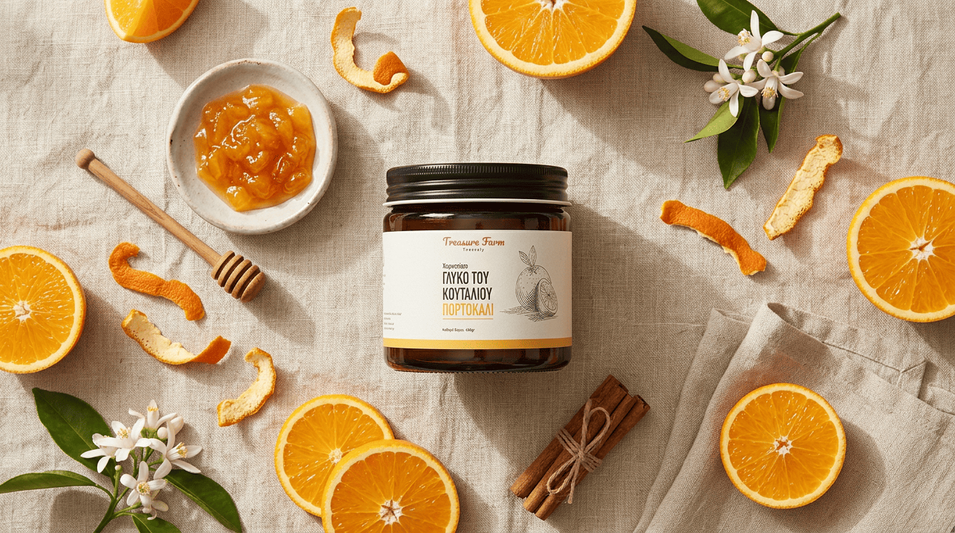
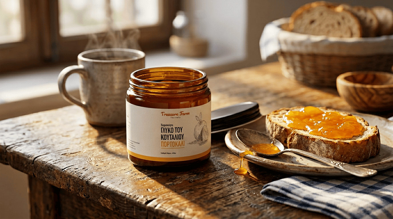
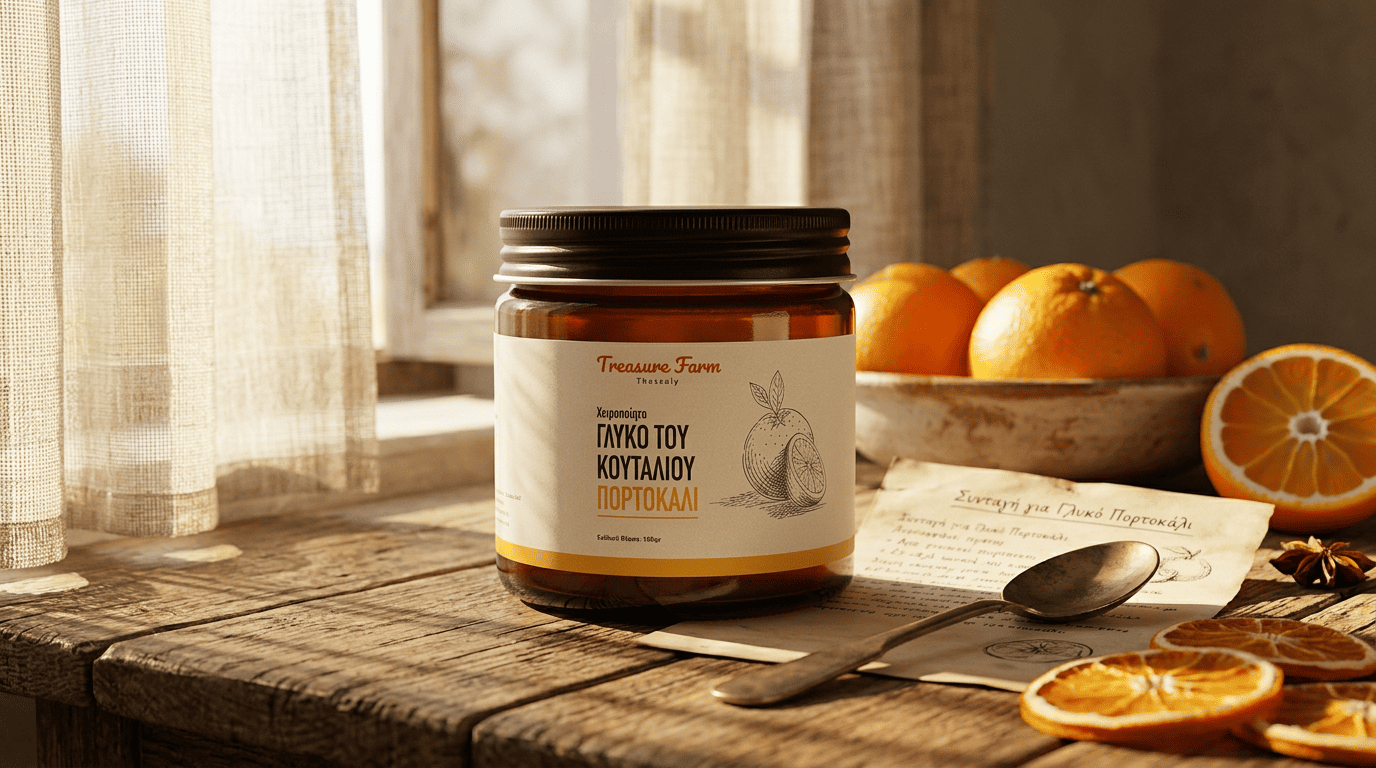
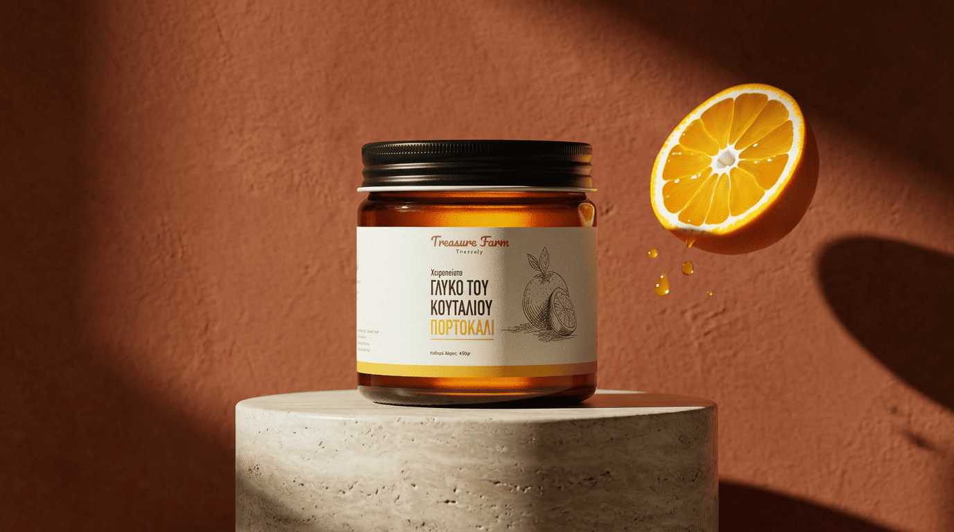
Treasure Farm Type Branding, Packaging Client Treasure Farm Thessaly Year 2026 The Client Producer of traditional Greek spoon sweets (γλυκό του κουταλιού), handmade in Thessaly Product range covers fruit and vegetable preserves including orange, apple, and carrot, all 450gr jars Targets specialty food shops, delis, farmers markets, and gift-driven retail where provenance and craft matter more than shelf volume Operates in a category where most Greek spoon sweets still lean on dated, overly ornate labels that fail to communicate quality to modern buyers Needed a packaging system that honored the traditional, handmade nature of the product while competing visually with modern artisan food brands Our Approach A warm, handwritten “Treasure Farm” wordmark in coral red, paired with a clean “Thessaly” subtitle to anchor the brand to its region of origin A cream label stock that reads as paper and craft rather than plastic and mass production, mounted on classic amber apothecary jars A flavor-coded color system at the base of each label: yellow for orange, orange for carrot, green for apple, making the range instantly scannable on a shelf Detailed botanical line illustrations of each ingredient, rendered in a traditional etching style that reinforces the heritage of the product A consistent typographic hierarchy leading with “Χειροποίητο” (handmade) and “Γλυκό του Κουταλιού” (spoon sweet), with the specific flavor called out in the brand accent color What We Delivered A packaging system that positions a traditional Greek product as a premium, gift-worthy artisan food item Clear flavor differentiation at shelf, with color coding that works for both Greek and non-Greek speaking customers A visual identity that holds up next to imported European specialty preserves while staying authentically Greek A flexible label framework ready for range extensions into new fruits, vegetables, and seasonal flavors Product Design Ampera Brew + Moka