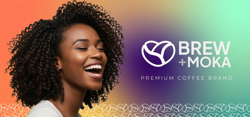
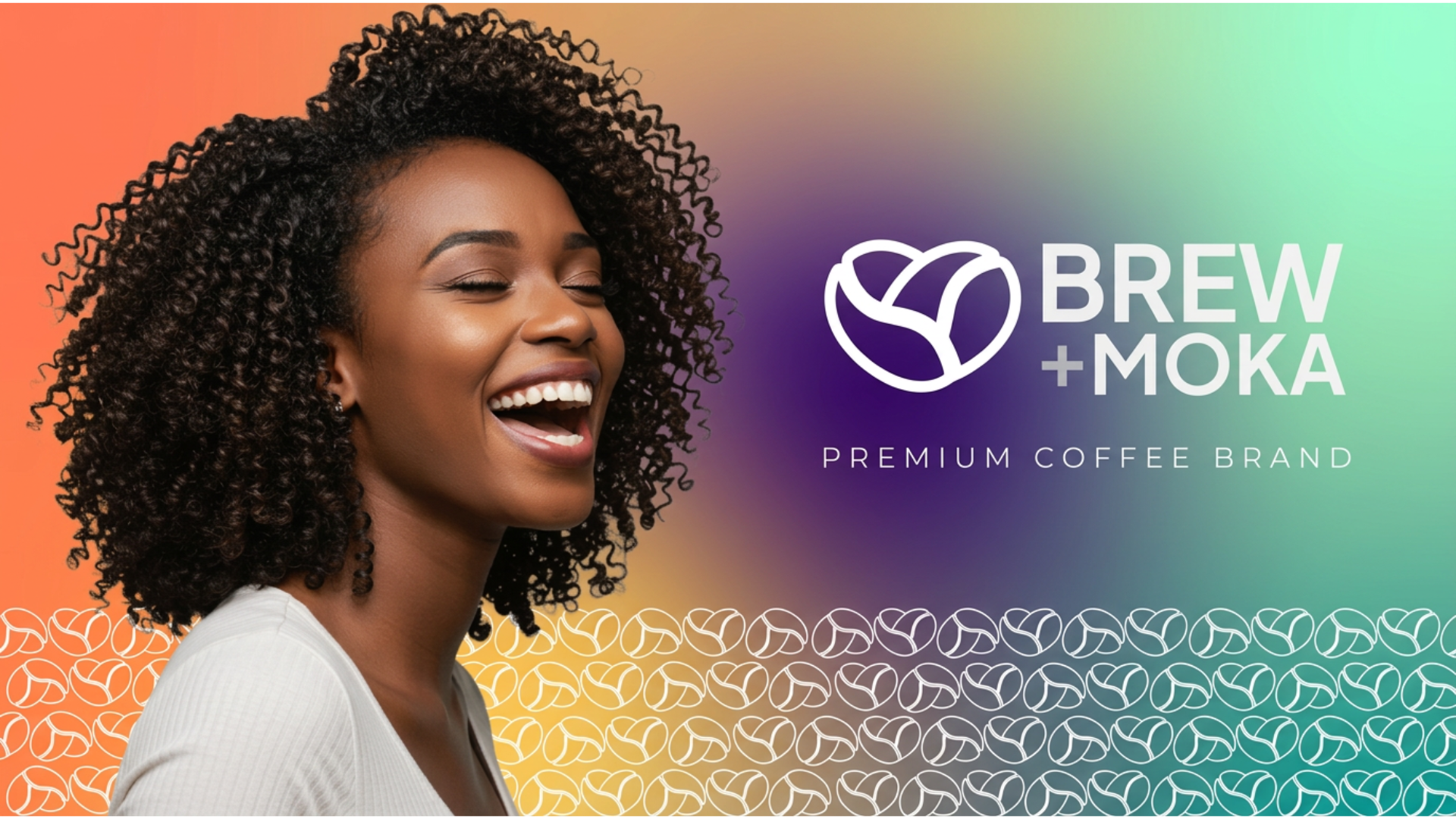
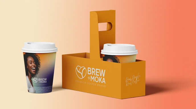
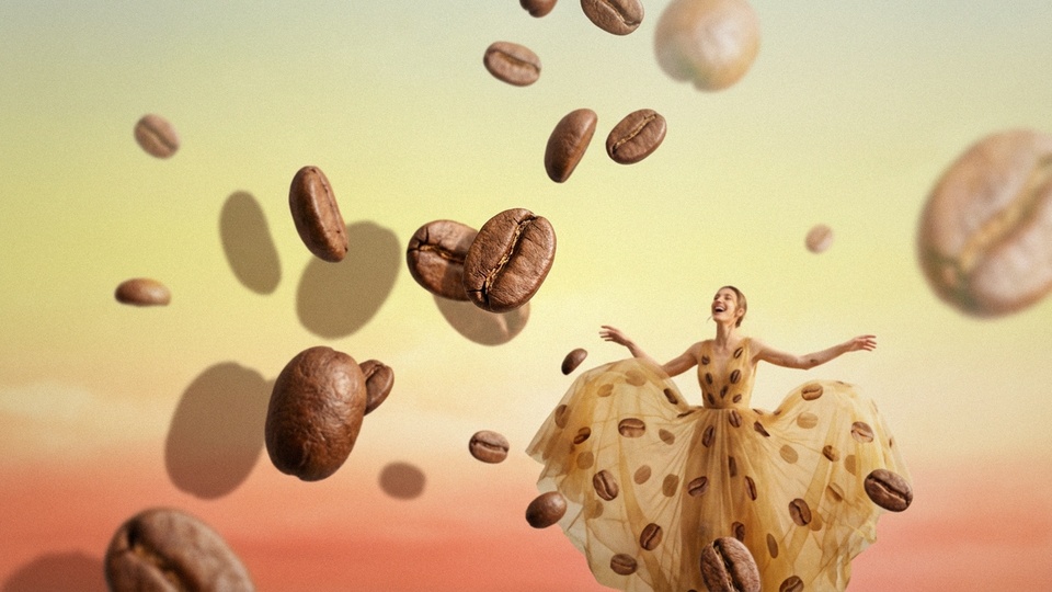
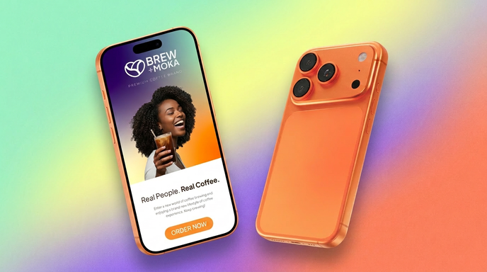
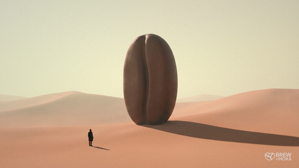
Brew + Moka Type Branding, Packaging Design Client Brew + Moka Year 2026 Our Approach A custom Brew + Moka logo built around a heart-shaped coffee bean mark, anchoring the brand around warmth, love, and ritual A “Premium Coffee Brand” descriptor lockup beneath the wordmark, positioning the brand confidently without needing extra copy A vibrant gradient palette running through purple, orange, and warm coral, designed to feel as energetic as the people on the cup Lifestyle photography integrated directly onto the cup graphics, putting real customer faces front and center as the primary visual What We Delivered A coffee brand identity with strong shelf and street presence in a category that usually defaults to muted, predictable visual cues A packaging system that turns every takeaway cup into a piece of brand advertising as it travels through the city A scalable identity ready to extend into seasonal drinks, retail merchandise, loyalty programs, and new locations A launch-ready toolkit covering logo, packaging, and social ad creative, all from a single system Treasure Farm Emad Dafchahi