MACTUR is a business transformation and growth consultancy focused on helping organisations build resilience, unlock opportunities, and create sustainable progress.
The brand needed a visual system that could support this positioning across every touchpoint. From LinkedIn content and Instagram posts to corporate reports, office signage, and branded materials, the identity had to feel consistent, credible, and easy to recognise.
Our goal was to create a design system that feels strategic, modern, and scalable.
We built the identity around structure, contrast, and clarity.
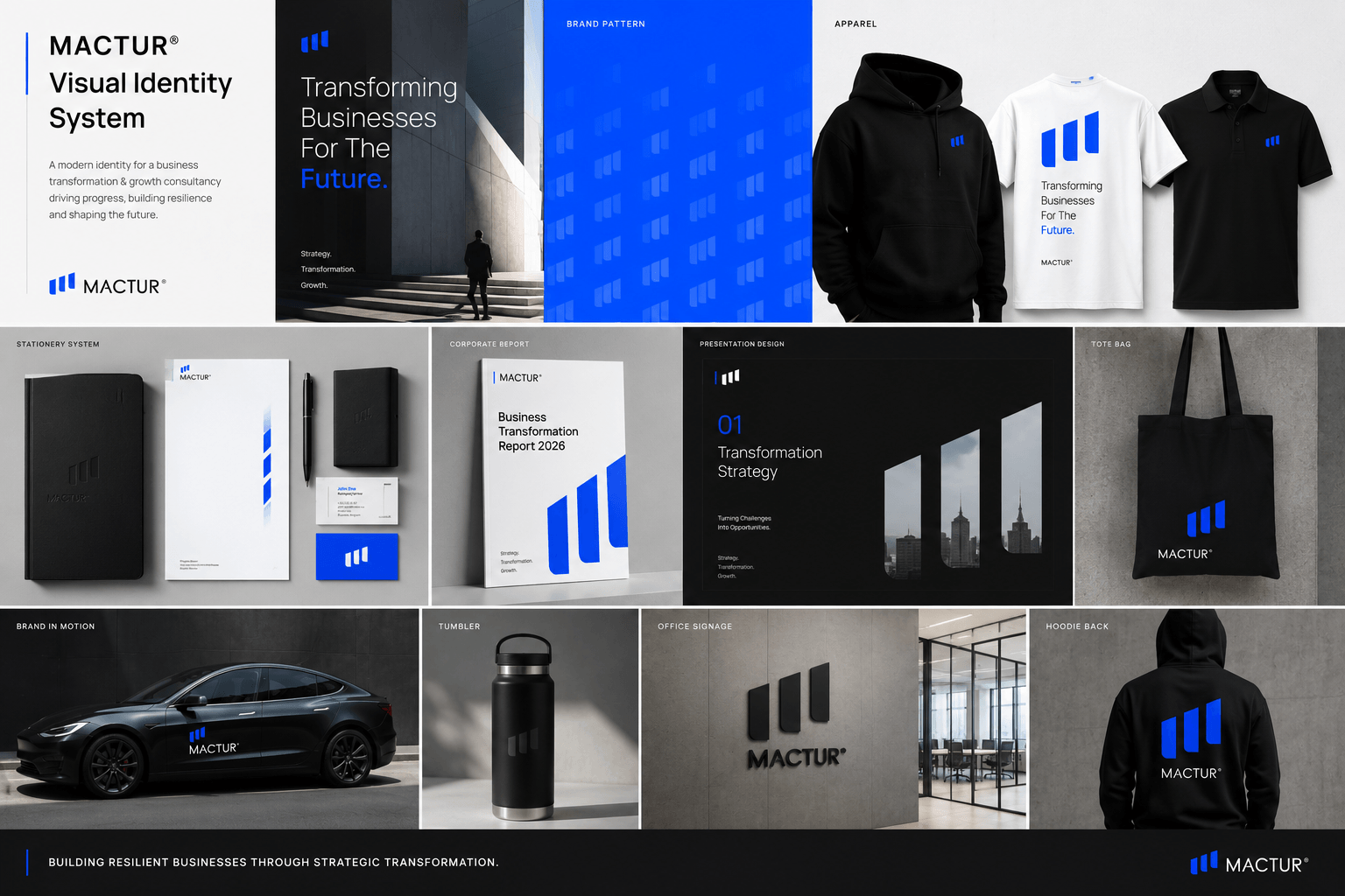
The visual system uses a strong electric blue as the core brand accent, balanced with deep black, white, and concrete grey. Architectural imagery was used to support the brand’s themes of progress, direction, and transformation.
The logo mark was extended into a wider brand language through patterns, layouts, report designs, social templates, and application mockups.
The system was designed to feel consistent across:
- Instagram post designs
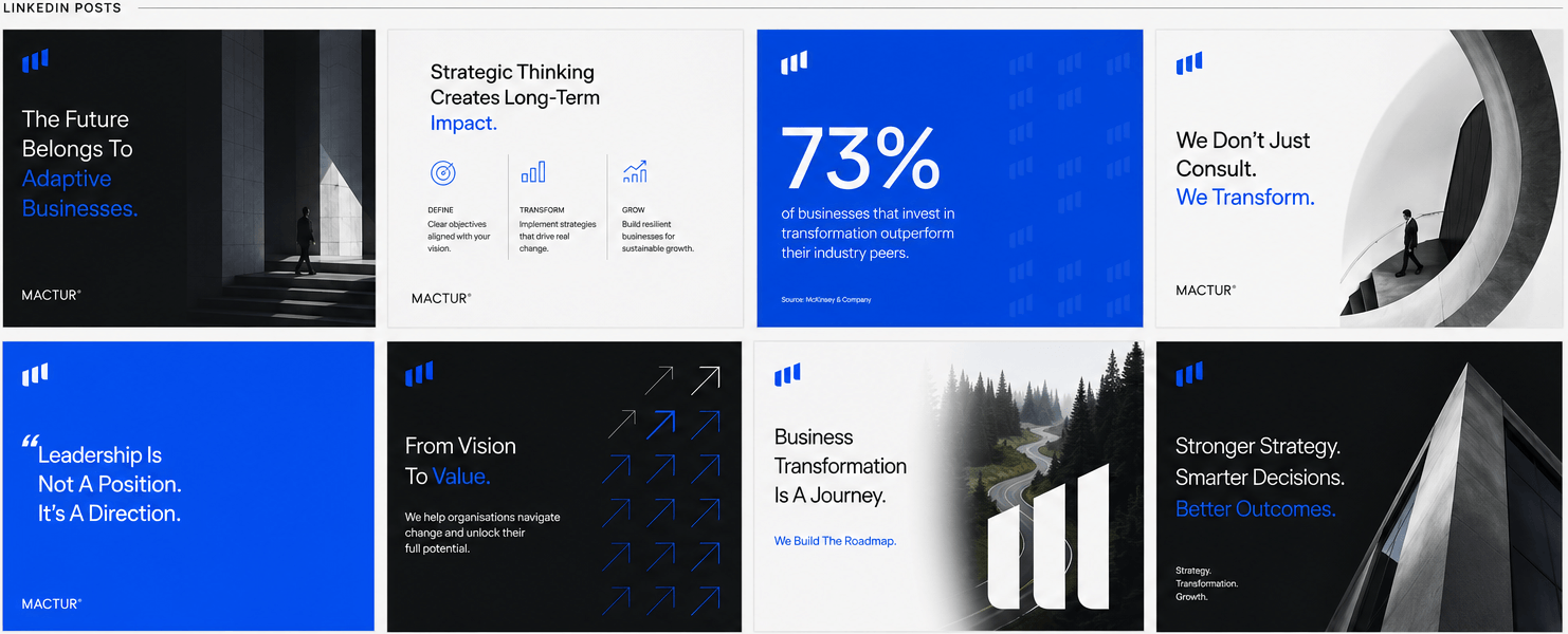
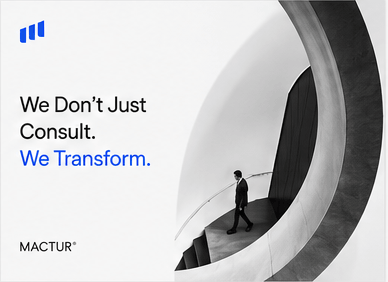
- LinkedIn post designs
- Quote and statistic cards
- Corporate reports
- Presentation slides
- Stationery
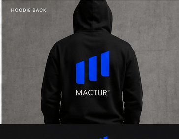
- Apparel
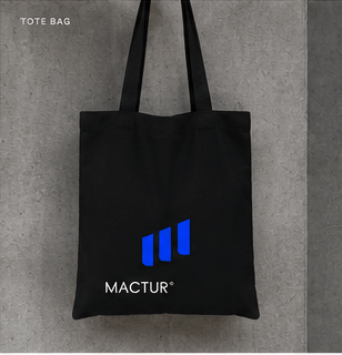
- Tote bags
- Tumblers
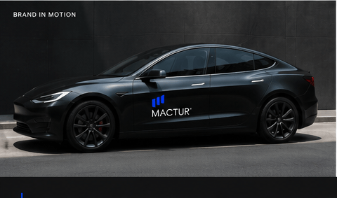
- Vehicle branding
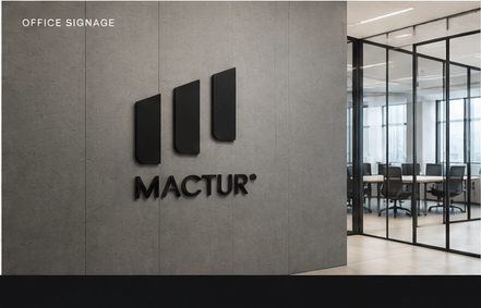
- Office signage
Every element was created to help MACTUR look clear, credible, and recognisable.
Visual Identity System
The MACTUR identity was designed to feel modern, structured, and professional.
The logo mark reflects movement and progress, supporting the brand’s focus on strategy, transformation, and growth. This visual rhythm was carried across brand patterns, layouts, and corporate materials.
The identity system includes a refined colour palette, clean typography, branded patterns, stationery layouts, and a flexible visual structure that can scale across multiple formats.
Social Media System
For social media, we created a consistent visual language for Instagram and LinkedIn.
The system includes headline-led posts, architectural imagery, statistic cards, quote cards, and strategic messaging layouts. This gives MACTUR a professional and recognisable presence across platforms, while keeping each post clear and easy to read.
The result is a social media system that feels polished, consistent, and aligned with the brand’s consultancy positioning.
Corporate Collateral
The identity was extended into corporate reports and presentation design.
These materials were designed to help MACTUR communicate complex business ideas in a clear and structured way. The layout system uses strong contrast, clean spacing, simple icons, and visual hierarchy to make business content feel premium and easy to follow.
Brand Applications
The brand was applied across physical and lifestyle touchpoints to show how the identity can work beyond digital channels.
Applications included apparel, tote bags, tumblers, office signage, vehicle branding, and stationery. Each application was designed to keep the brand consistent, professional, and recognisable in real-world use.